
HI, i’m Rajvir
I embarked on my professional journey in the realm of computer engineering, acquiring valuable skills and fostering a strategic mindset from the outset. However, I soon recognized a lack of the creative elements I craved. Consequently, I shifted my focus to Design. Now, utilizing the engineering expertise and mindset I cultivated earlier, I embark on design endeavors with a specific emphasis on design engineering and user experience (UX). My overarching goal is to craft enhanced products and enriched experiences.

BLock Grabbing Robot
the Challenge
This robot was designed by with the objective of being able to swiftly pick up and place 1.5x1.5 inch blocks on different platforms. Our robot was designed with the goals of simplicity, efficiency, and accuracy in mind. The way these goals were interpreted was a final design that had a rotational base, an arm that moved up and down on the base, and a set of grippers that opened and closed on the end of the arm.
Ideation

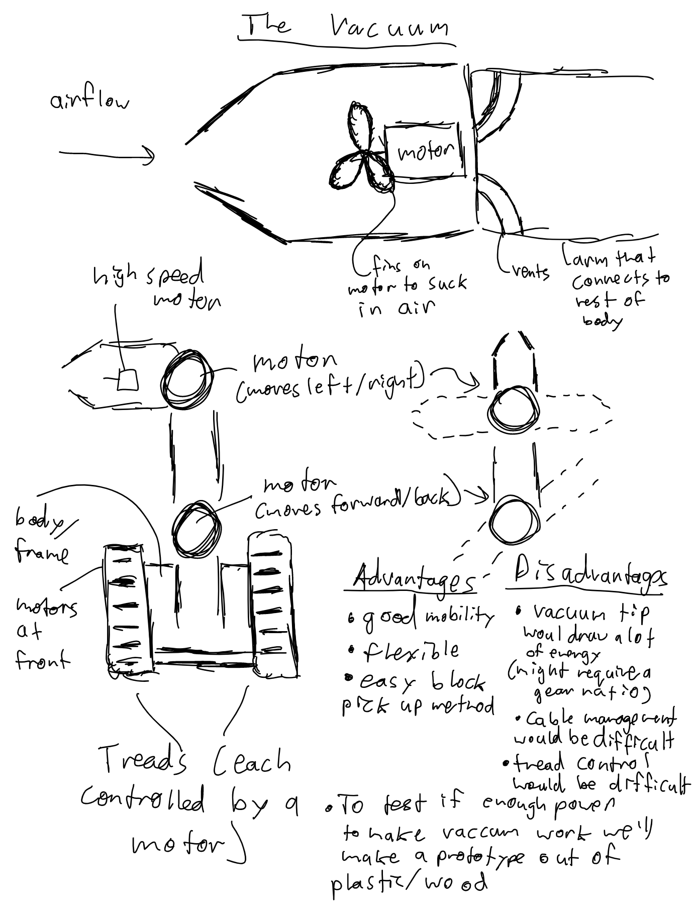
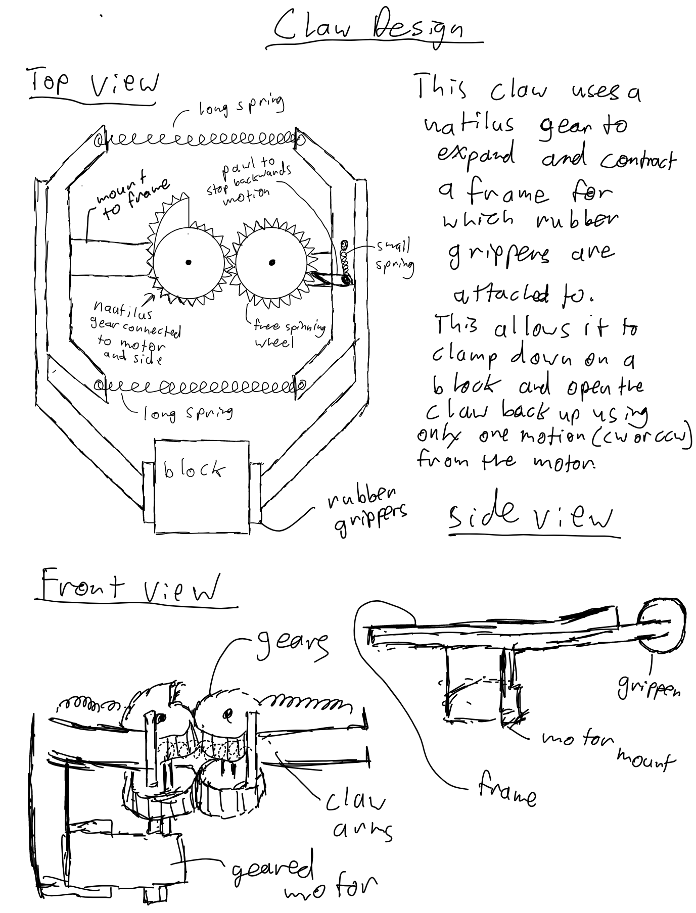
During initial ideation, we came up with and weighed the pros and cons of many different ideas. Some of these ideas included different types of claws, a forklift, and a vacuum that would grab the blocks. After considering the ease of manufacturability and efficacy of each of these concepts, we combined some of the ideas to create what our final concept would be: a gripper arm on a swivel base.
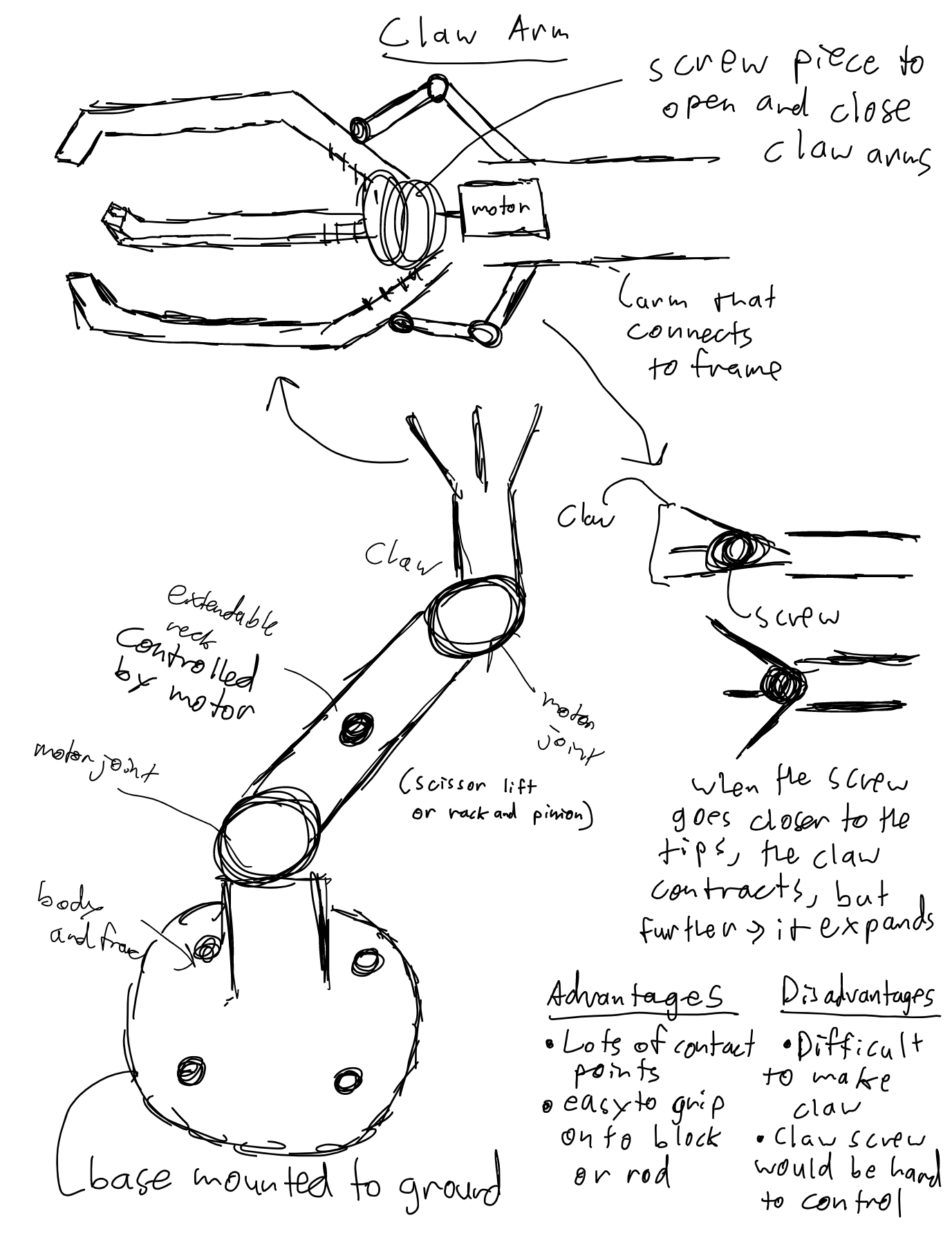
How it works
The Swivel Base
We wanted to use a single dc motor to rotate the base of the robot, but in order to do that, we needed to have the weight of the arm and the torque required to turn the robot lessened or eliminated. We got a little bit creative with this, mimicking the design of a microwave plate with acrylic wheels in order to allow the robot to turn easily and efficiently.
The Arm
The arm we were creating had two limbs: a shaft and a gripper. These two limbs would create a different torque load on the motor depending on how far away from the base they were extended, thus we needed to have high torque in order to deal with this. We used a motor with a 1 to 4 gear ratio on the base to control the angle of the shaft and then a 1 to 3 gear ratio to control the angle between the gripper and the shaft.
The Grippers
We came up with a design that used spring tension to our advantage. This design uses two extension springs at the front which hold the gripper fingers together. Then in the back, there’s a fishing wire attached to a motor that acts like a spindle, so when the motor is turned, the fishing wire gets wound up and pulls the back of the two gripper fingers together, which then opens the front.
UCSD Design Lab Sign
UCSD Design Lab Sign


The Problem
When people would visit the Design and Innovation building to look for The Design Lab, they would often get lost or confused, there was no way to recognize where The Design Lab started and ended and no directory in the building at all. Most people would find their way through word of mouth or exploring the building and asking around. So we developed a problem statement around this:
How might we help students and faculty who want to visit the Design Lab recognize where it is when they are in the Design and Innovation Building?
The Ideation
We went through lots of ideas when attempting to find solutions for the problem we defined, lots of them being based around the Idea of a sign in the main staircase of the Design and Innovation building that would be placed at the entrance of the floor that The Design Lab was on. Initially, we thought through making a sign that was made out of a different material for each letter in the word “design.” The purpose of this was to represent each of the different groups of people present in the Design Lab including UX designers, human behavior researchers, neuroscience researchers, and more. Eventually, we ended up settling on a sign that was a bit more in line with UC San Diego’s professional brand.


The Prototypes
After making a few visual mockups and getting them looked at by faculty at The Design Lab, we were ready to prototype. Our initial prototypes were constructed from cardboard and were made using a laser cutter, tape, and a set of hands. After making a prototype in color and changing the wording of the sign a bit to respect the conventions of the UC San Diego Brand, we played around with the size using laser-cut wooden letters and once we were happy with it, we decided to move on to the final version.
The Final Sign
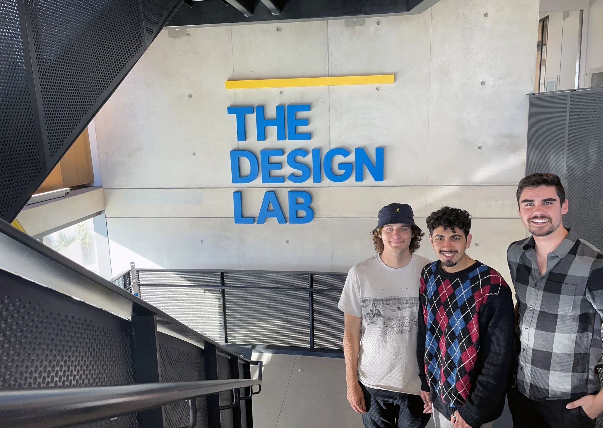
Christopher Erpelding, Beck Rinks, and I finally constructed the sign using construction foam, a CNC router, and some blood, sweat, and tears. Sitting at the edge of the staircase that leads up to the Design Lab, this sign has made it notably more apparent to people where they were headed in the building and has even drawn more traffic to The Design Lab as it has become a popular photo spot for visitors and those involved in the lab itself as seen in the pictures above.
Sunlight Switch
Why Are the Lights Off?
Has an automatic light ever turned off while you were still in the room? — This was the question my friends and I were asking ourselves when discussing the use of motion sensor light switches in works spaces. One minute you’re on your grind and the next you have to awkwardly wave your hands around in the air for a bit until the lights turn back on, and then it happens again. So we decided to give it a redesign.
The Problem
Modern-day automatic lights use motion sensing, and only motion sensing, to determine whether a light should be turned on or off. People aren’t always moving past a sensor when they are working in a room. There needed to be other ways of determining human presence.
Furthermore, while current automatic light switches have a reputation for saving energy, they don’t take natural light into account. In workspaces with windows and skylights, there are many hours throughout the day when natural light is enough to work in.
We thought about these issues and came up with a pretty creative solution: monitoring the light and sound in an environment. Monitoring the lighting would allow a switch to know if there was enough natural lighting for a space to be workable. Additionally, sound is a great indicator of the presence of someone in a workspace. Even if they aren’t really talking or moving around, they are creating noises by typing, scribbling, or even just breathing. Using these as inputs, we created the Sunlight Switch.
How It Works
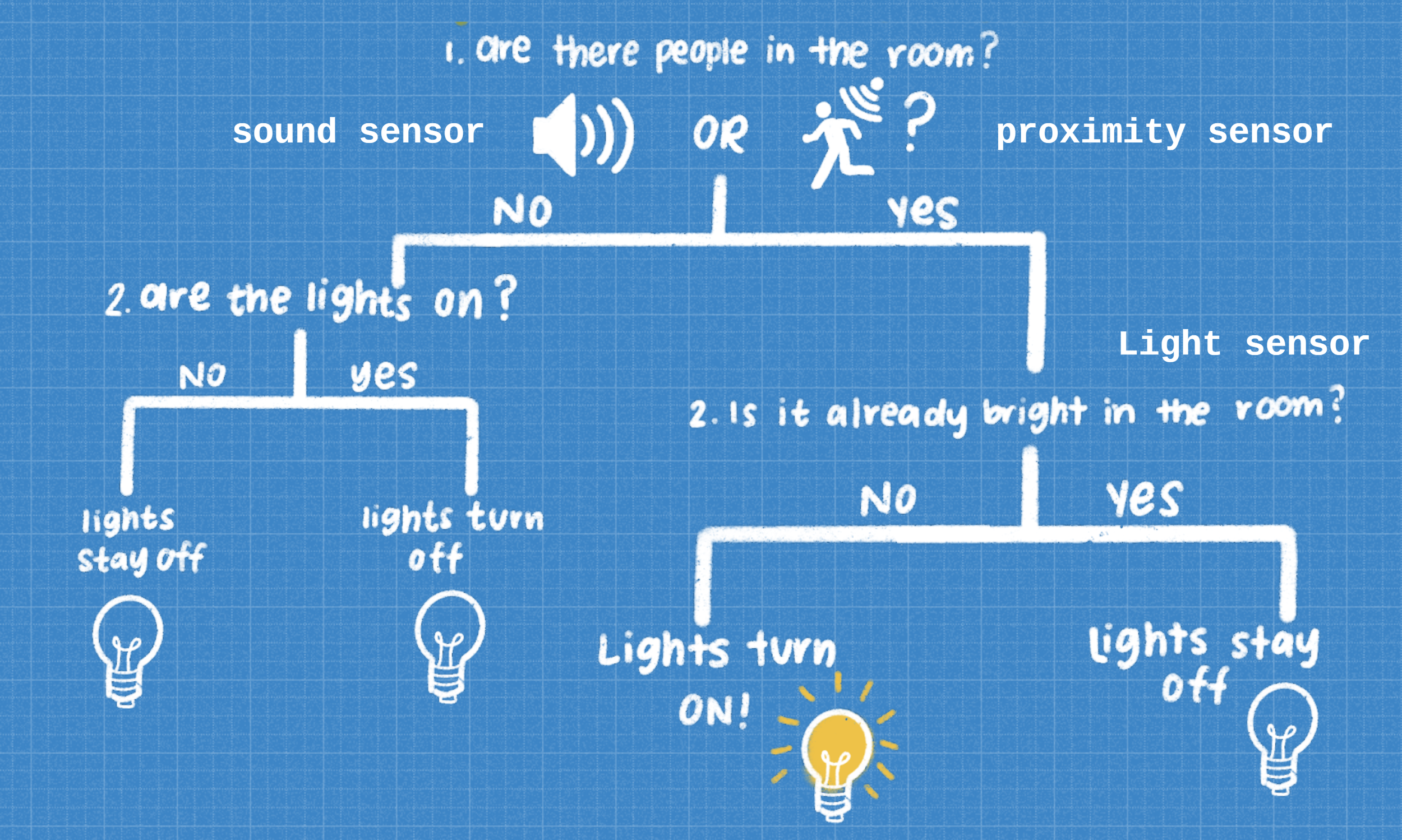
The way our device works is by taking inputs from a sound sensor, proximity sensor, and light sensor (which were all included in the Adafruit Circuit Playground Express we used to build this device) to tell if the specific conditions are met to have the lights on or off. The diagram to the left depicts the order in which these inputs are taken and what the result is based on the condition.
What’s More?
Our device is modular! Forget having to install a switch and reinstall a new one. You don’t have to touch the electrical wires at all! Simply unscrew the top of your current light switch a little, slide our device on, and you’re ready to go! It uses the sensors in the front of the device to monitor both natural light and human presence and uses a servo motor in order to physically move the light switch to the on or off position.

Card Terminal Redesign
Where Does my Card Go?
Have you ever gone to pay with a card, but you don’t know which way to put it? — If so, you're not alone. I’ve seen countless people who were either confused or used their card incorrectly at a card terminal and I decided I needed to know why. I found the 5 most popular card terminal systems in my area (pictured on the right) and studied user interactions with them to make a lo-fi redesign. After a series of interviews and observations of users paying at these various terminals using the chip, tap, and swipe functionalities of their cards, I came up with a redesign that would eliminate the confusion.

Data Collection and Analysis

I interviewed a plethora of people and observed as they used my card to pay on all 5 of these machines. To the left, you can see the number of errors made (i.e. the card was oriented in a way the terminal couldn’t read) when the 17 interviewees each paid with chip, tap, and swipe of the card.
A vast majority of the errors were rule-based mistakes because the interviewees misinterpreted the rule that the system image had attempted to portray regarding how to pay with chip, tap, or swipe. The most errors were made when people were swiping their cards because it wasn’t clear which direction the card should face and which direction to swipe in on most of the machines.
Trends and Redesign
Through our data collection and analysis, we acknowledged that our interviewees had a familiarity with specific terminals and their standards, we drew upon some culturally standardized features of cards to better signify, through familiarity, to users what the correct way to insert, swipe, or tap their card is. By doing so, users will be given a familiar design to operate with and more naturally operate the new product. Also, we have decided to use a bigger and wider touch screen and silver-colored outlook to enhance the aesthetic level of the machine. While features like these were a trade-off for clarity in the machines we showed to interviewees, we added extended panels with signifiers to enhance the discoverability and clarity of our redesign.

